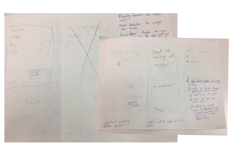
Interaction and Visual Design, Project Manager

LA Fitness (Student)

The Goal: To motivate gym users to continue their workout routine and work towards their fitness goals.

The Problem:
We found that the L.A. Fitness app isn’t meeting customers’ objectives of tracking their fitness progress, which is causing users to defect to competitor apps, neglect the LA Fitness app completely, or skip tracking their workouts.

The Solution:
We see an opportunity here to create a new mobile app feature that helps LA Fitness members become healthier, happier versions of themselves by creating a fitness tracking feature.

About
Iphone application for LA Fitness – Student project tasked with identifying a user based need or improvement on the current app. Developed a workout tracker to motivate gym goers to continue their membership.

Overview
Conducting three types of user research, the team made sure the tracker was the most useful direction to allocate our two weeks. This involved competitive and comparative analysis, identifying our MVP, user input, and iterate based on user feedback. The research dictated what was included in the sketches and wireframes. The current colors, font, and spacing used on LA Fitness’s app guided the high fidelity mock-ups, and final design.

Role
For this project, I was the Project Manager, Interaction, and Visual designer. I collaborated on user interviews, and affinity mapping. I was responsible for making sure that deliverables were on track, communication, and our timeline. I also created all visuals including sketches, user flows, wireframes, usability tests, style guide, high fidelity mockup, and clickable prototypes.

Tools
Trello, Monday.com, Sketch, Omnigraffle, Excel, Keynote

Research:
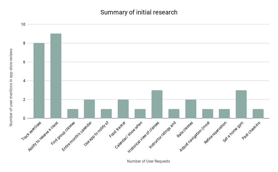
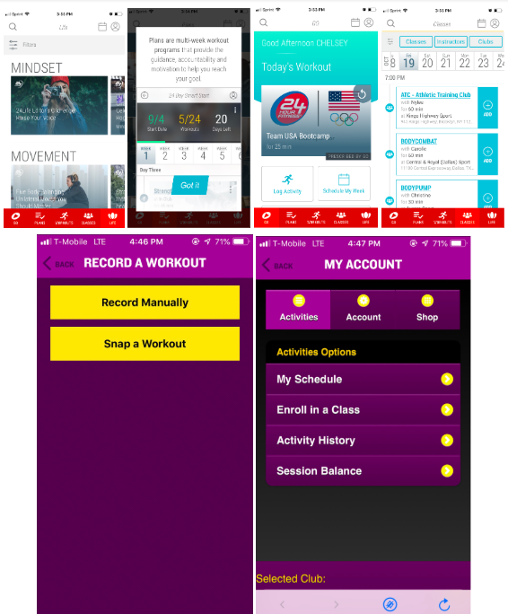
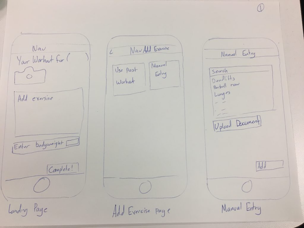
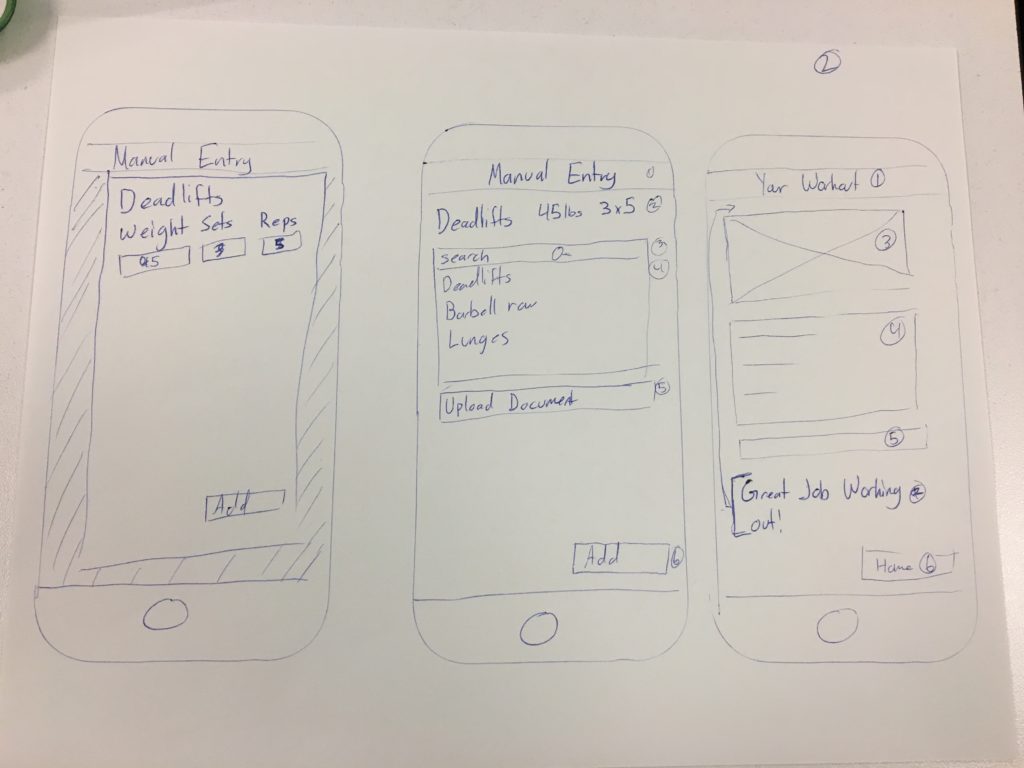
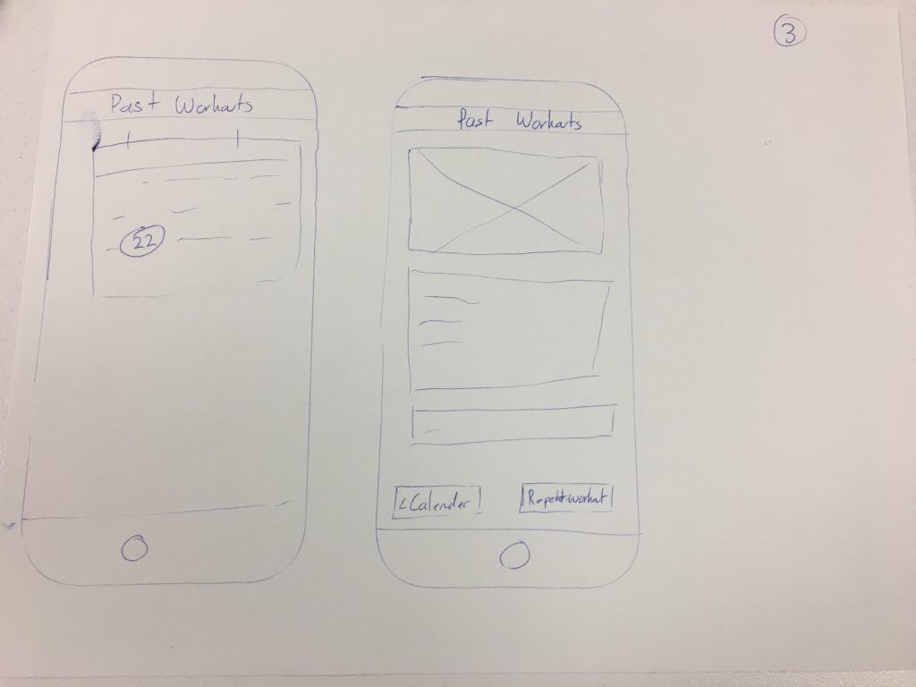
We started out by looking at user responses on app to find main complaints. Devin came up with a list of main wants from users of LA’s app, and that gave us a launching point for our direction. They wanted to be able to reserve classes, be able to see their past logins, set a home gym, and leave comments or rate classes.

I called the West Seattle and Ballard LA Fitness campuses, and they only require a reservation for their cycling classes because they have a limited number of bikes. All of their other classes were drop in, so that isn’t a feature that would need to be developed. We can solve that problem with a bit more clarification. Setting a home gym isn’t as much a feature, and none of our user interviews indicated users wanted this. The last two were still questions, should we make a class rating and review system, or make a feature that will track your past usage of the gym?

Devin created a survey to capture more data from our users, and confirmed that our users are in their twenties and thirties, many don’t know their gym has an app, and the top three activities are weight lifting, cardio, and the workout machines.

From there, she conducted 6 user interviews, and we used information from these interviews to create an affinity map, and personas.

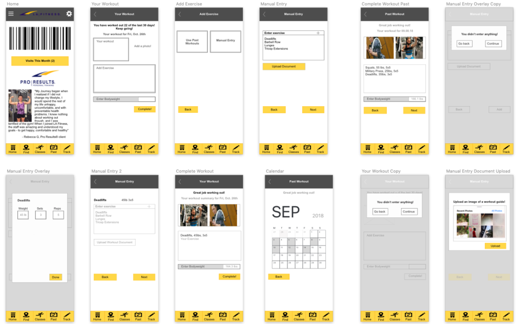
We found is that the L.A. Fitness app isn’t meeting customers’ objectives of tracking their fitness progress, which is causing users to defect to competitor apps, neglect the LA Fitness app completely, or skip tracking their workouts. Without tracking progress, it’s easy to lose motivation, get discouraged, frustrated, and stop working out. 

In order to get understanding on the field, I researched other gym apps, and looked at their tracking systems.

First Sketches

Sketching:
I started sketching a few basic ideas, and tested them with users. They provided feedback such as adjusting how one enters images on the home page vs in the manual workout entry page. We also added the choice of “used past workouts” vs “manual entry”. This begot a need for a calendar portion, which we had been oscillating on if it was within our scope or not. A quick “past workout” and calendar function were added, which also aligns with our problem statement. We decided to utilize different pop-up windows on one of our tabs to increase enjoyment of users, and to break up our flow to make it easier to work with.

Second Sketches

Task Flow:
Using feedback from our users, I came up with an ideal user flow to gain insights on what types of pages were needed.

Design Studio
We did a “Design Studio” sketch as a team to iterate and quickly come up with a few different options for the app’s home page.  Our focus was the app’s main page.  While it wasn’t our main focus, the users could benefit from a landing page that assisted our target users in their goals at the gym: to easily see how many times they’ve been at the gym in the last month and log to your workout.  

We went from LA’s card buttons and carosole hero image to your personal barcode to sign in to LA fitness as the first function. We wanted the sign in feature to be the first thing on the home page so that more people would use the app to sign in, and then use our tracking feature since they’re already there. Current users of the app indicated that this was the primary reason many of them logged in to the app, and we wanted to utilize this opportunity to drive more people to the app. We also went from the card buttons to a persistent footer navigation that would stick through the whole process. We discovered through a usability test that the icon we used in the wireframes for classes was unclear, so that was adjusted in the final product. Both user research and competitive analysis indicated the need for an “at a glance” view of a person’s progress; we did this by showing how many days in the month you’ve logged in to the gym. The “what’s new” portion will indicate any class changes, random closures, new locations, and the like.

This was an exciting opportunity to collaborate with the entirety of the team.  Devin and I put in a lot of effort to find how the two of us could work together on this project, she is very detail oriented and I tend to focus whole picture.  Both of these have their strengths and weaknesses, and I learned to slow down and pay attention to details.  This exercise was great because we knew each other better at this point, and could work together to fit what our users needed.

Wireframes

There were some changes between the sketches and wireframes based on user feedback.  One change was adjusting the copy to be more clear. A requirement was also created for adding something into a workout day. This was added because users wanted to see something about what they had done that day, be it a picture, the name of some sort of exercise, or bodyweight.  I also created a way to edit or delete your past workouts. 

At this point in the process, our deadline was soon approaching. As PM, I jotted down the tasks that needed to be done, and set blocks of time for each task. While I would have liked to refine my prototype more, it was time to move on.

Here are some of the wireframes for this app
This is the second page of wireframes, and the color was a screenshot

Annotated Wireframes

High Fidelity Comps
The style guide was information I was able to glean off of LA Fitness’s current app.  I used this information to add color to our wireframes, as my first attempt at high fidelity visuals.

Full Functionality:

Our main workout page presents with three options. You can upload any pictures from your workout (inspired by competitive analysis and user interviews), you can add exercises, and your bodyweight. All of these are optional, but you have to enter something in to be able to log it. This requirement is to reduce erroneous entries. If you select the camera, it will open your phone’s camera, with an option to go to your gallery (just as texts do it). Adding your weight would be simple, and it would be in pounds. You can change your metrics in the settings function on your account.

Adding an exercise is where the magic happens. On this page, your first option is to start typing in the name of your exercise. The program will attempt to self fill, and guess what you are trying to input. If one presses the plus symbol at any time, the text entered into the text box will be the only thing logged. Since our users mostly are weight lifters, we have the automatic pop-up screen that asks for the weight, sets, and reps of your exercise. Based on user input during a usability test, we added a “not applicable” option on that screen for things like hikes or basketball. Our user can enter as many workouts as they would like by repeating the process. You also are able to upload a document to help with your workout. Almost half of our interviewed users bring in an image or screen capture of a pre-set workout they are following. This function would let those users simply upload their picture to log their workout, and be done. Once you’ve added a document, you can hit “complete”, which will take you back to your workout summary. All of your information will be added to the summary page. This change was brought in during our first round of prototype testing when people were confused on the “congratulations” page, and felt “workout summary” was more clear, and a larger difference from the original workout page.

We feel like our ability to provide a useful tool for multiple users has expanded our user base, and will increase people tracking their workouts in the app. This will drive more people to our app, and keep them motivated to continue to workout and keep their membership active.

In the future we would like to add more options on the pop up screen when a user enters their workout information. Currently our design assumes you want to enter weight, sets, and reps, but we would like to have a tab that you could enter duration for cardio. We also considered the option of tying in a social element, and ability to share the pictures taken during your workout to set challenges, give advice, and see how other people who use your gym are working out.

Results:
At the end of the project, I had built a tracking system based on user research (done by Devon) that could fit into LA Fitness’s app.  After our high fidelity prototype was built, we were able to validate our design with gym users. They confirmed that it was easy to use, and would improve their overall gym experience.  We had explored different ways of contributing, and our users agreed we were successful! I liked our concept and where the project was going, but I wish that there was more time to fine tune the visuals.

I learned:
Just a little more research can answer a puzzling question!  Users gave two main pain points with the current app, and we were researching to see which was more needed.  After a quick call to LA Fitness, they confirmed that one of the proposed features (class reservations) were not needed because their classes were all walk in!  That could be solved with a message on the class page, a reservation section did not need to be built out.

I learned that figuring out how everyone in the group works best and then arranging our work day like that was super important!  When we did not honor how we worked, very little got done and both of us found it extremely frustrating. However, when everyone had room to get their tasks done, it turned out better than either of us imagined.
Because I was working on a team, I put in more effort and did a better job, as I knew others were relying on my work.  It was inspiring.

For our next steps, it would be important to make it clear on LA Fitness’s app that classes cannot be reserved on an appropriate page.  We also would build out a cardio section for the tracking page.