Interaction Design

Lonely Produce

The Goal:  A B2C marketplace for small farmers to help reduce food waste and maximize sales.

The Problem:
Farmers need a way to easily digitize Fresh Sheets on Lonely Produce’s site. That way farmers can reduce food waste, increase profit, and track past inventory of produce.

The Solution:
Lonely Produce is developing an accessible platform for farmers to enter digital Fresh Sheets. By focusing on designing the interface of a Content Management System, farmers can distribute their Fresh Sheets to a wider audience and see analytics on past inventory.

About
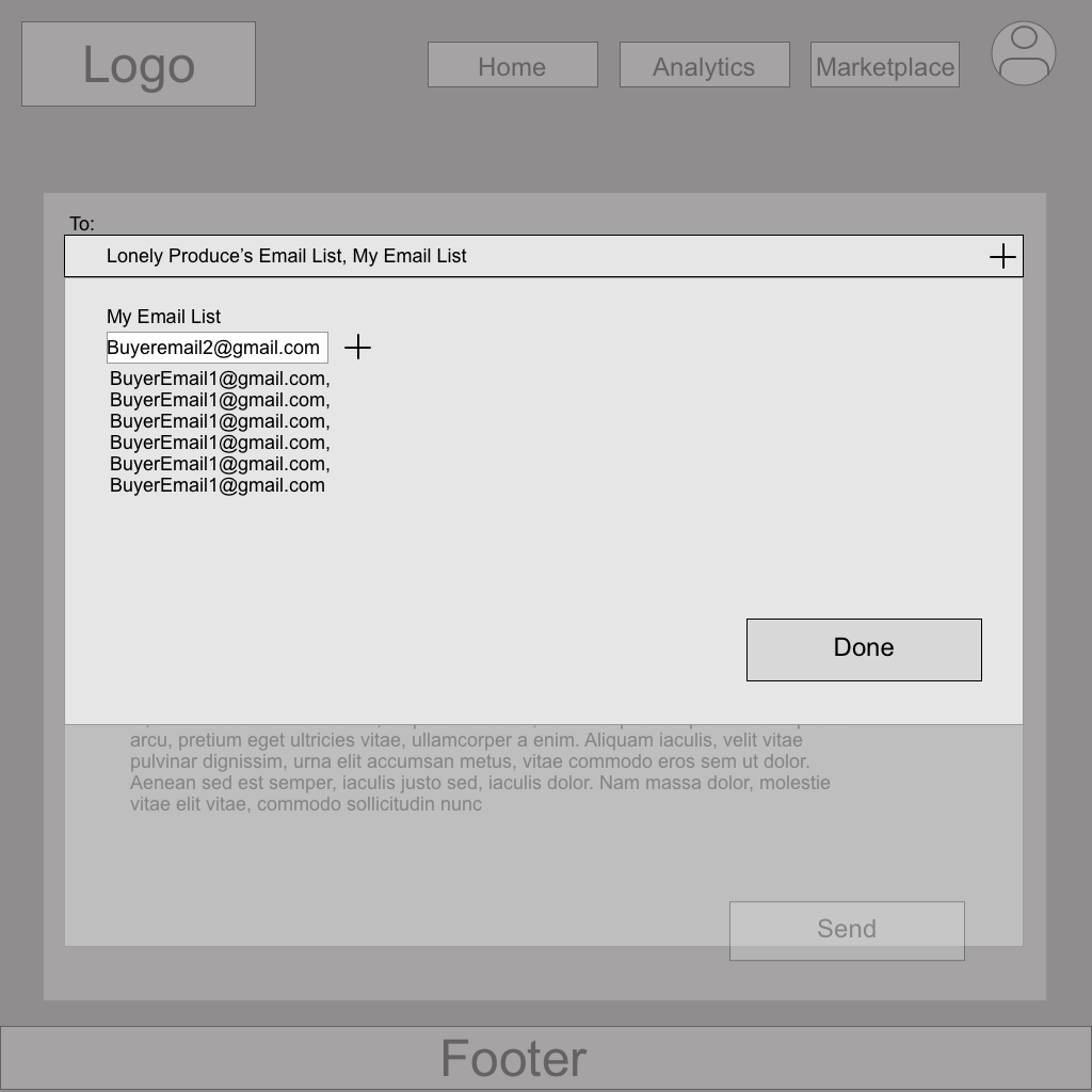
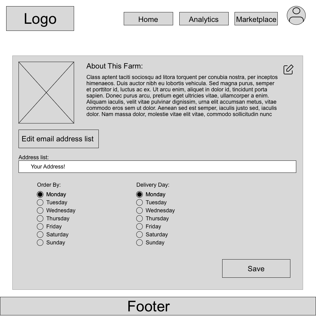
Web based application for Lonely Produce – Tasked with creating an inventory uploading platform for farmers to keep track of their available produce, and send out their items to potential buyers in order to reduce food waste and support small, local farms.

Overview
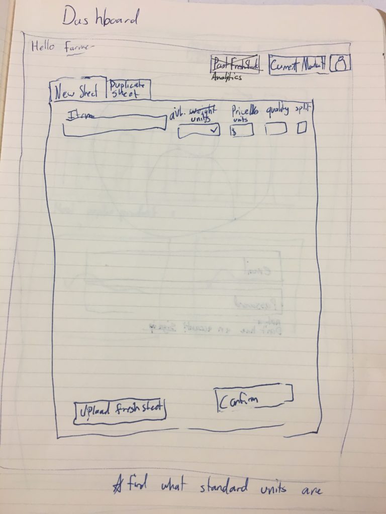
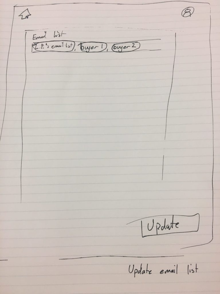
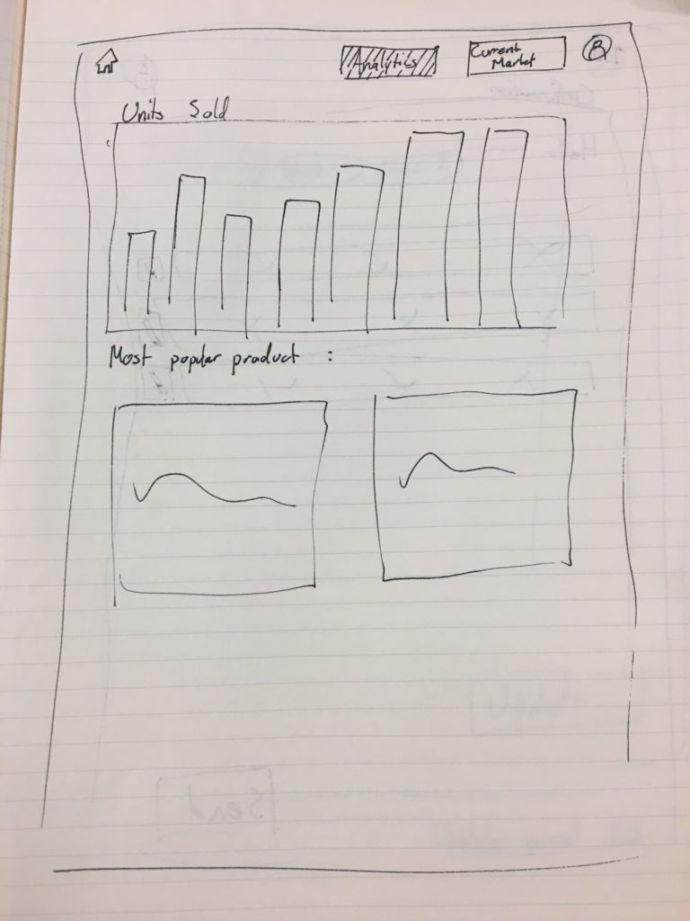
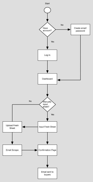
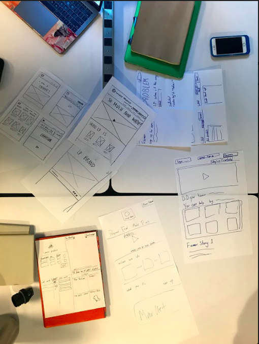
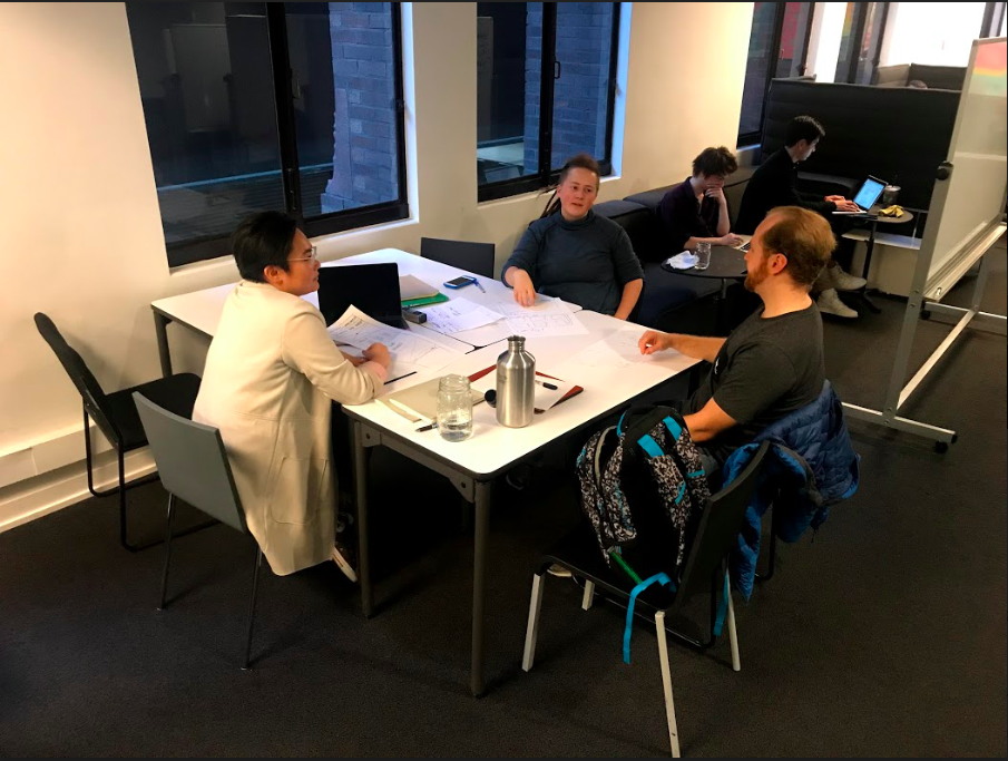
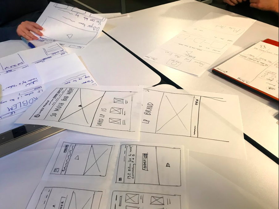
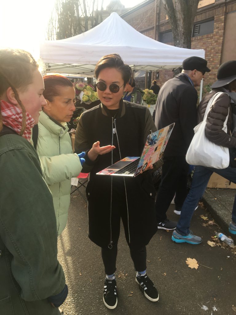
During a three week sprint, my team identified a possible problem with the owners of Lonely Produce, and our researcher conducted some initial interviews, and discovered the need to pivot. We found another problem, and validated it through research, and updated our stakeholders. I created sketches, we validated, I built wireframes, we validated, clickable prototype, (you guessed it, we validated), and finally a high fidelity, clickable prototype.

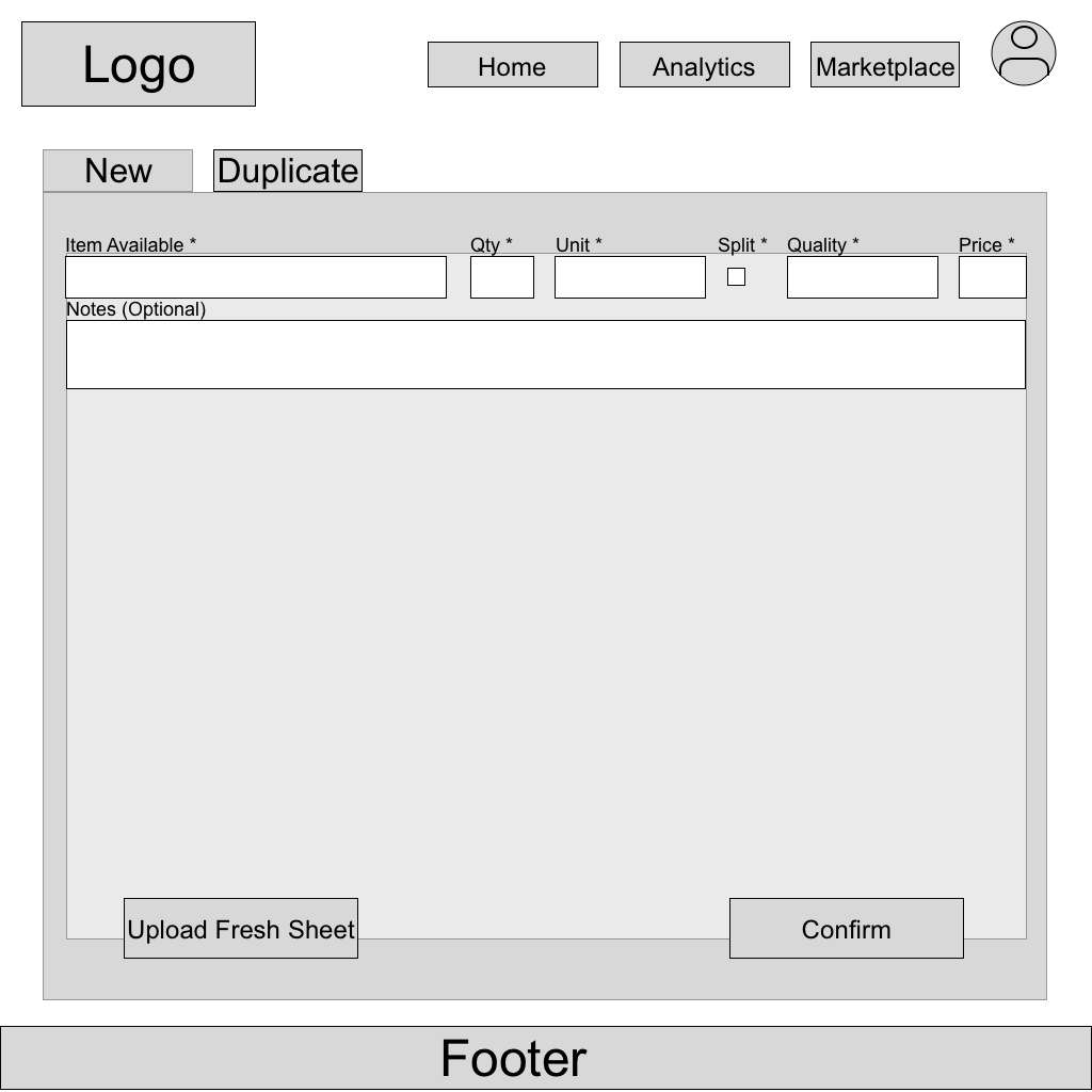
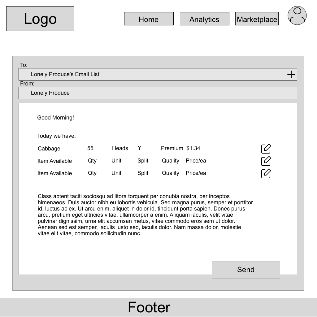
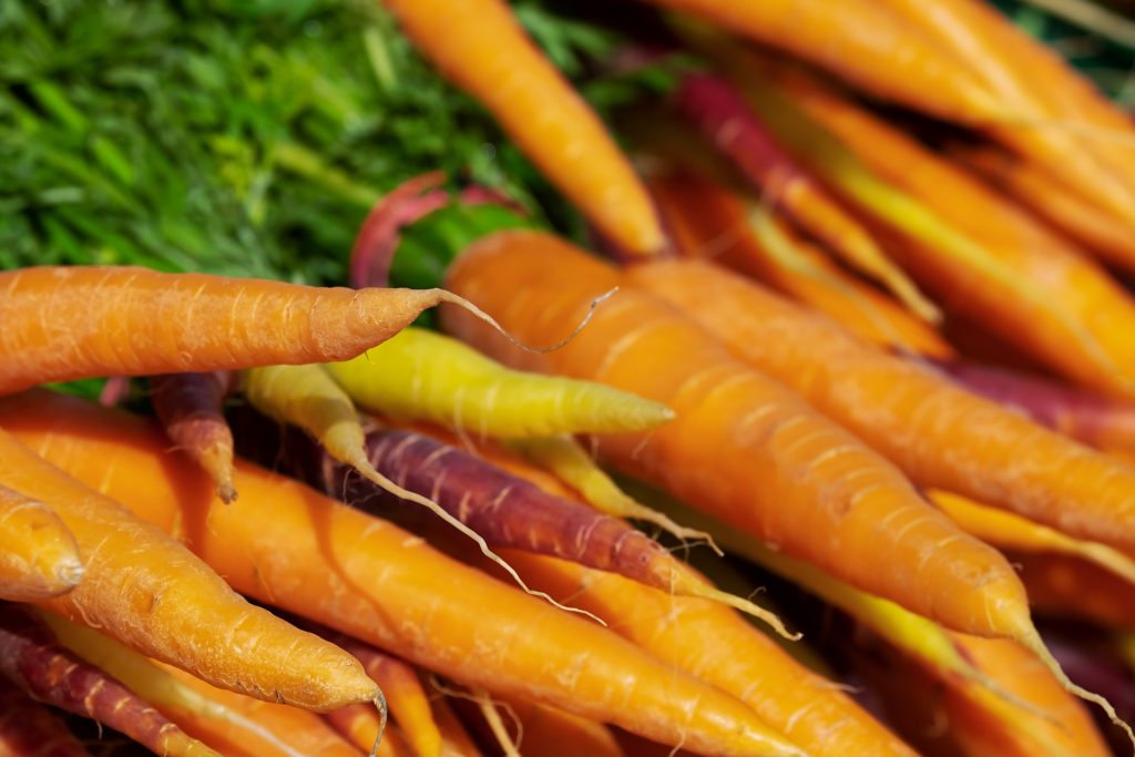
Lonely Produce is addressing food waste in small farms. About 20% of produce grown by most small farms is left to rot in the field because farmers cannot find buyers for their produce. Our job was to help reduce food waste by creating a system for farmers to upload their product to a content management system. From there, Lonely Produce could build out a marketplace to reach buyers.  At the end of the project, Lonely Produce loved our design!

Role
I was the interaction designer, so I was in charge of:

  • Low-Fidelity sketches (drawings/wireframes)
  • User Flows
  • Wireframes (all iterations)
  • Prototype Development

The Results:

Our client loved what we did on the project! Our presentation went well, and they’re looking to implement our designs. We created an input system for farmers to upload their produce in a formed, digital way, which was our goal! I was very surprised that our users were not already keeping track of their past produce. With the new tool built, Lonely Produce will be able to help solve that problem.

The next steps would be to build out the marketplace side of the business!

Things I learned:

In this project, I learned to trust and rely on my team, and their portions of the project. I had no hand in the research process, and did not touch the visuals. Since I was on such a strong team, I was able to work within a timeline, and trust others to do the same. We were able to accomplish much more than if everyone was a part of every decision.

I also learned how important scope is. When we started to talk about who our users were, the team started to go down a path that we did not have time for or knowledge on. The researcher brought us back to our actual time frame, and we had to make a decision on what we were doing to create something within the three weeks.

The Process:

My role began about halfway through the project. Our researcher had established who our primary users were, and what types of things they wanted. 

The users informed our decision, and we began making an easy to use input for farmers to upload fresh sheets. The examples of fresh sheets Lonely Produce provided at the beginning of the project dictated the categories for the input form.

First Sketches

Some basic sketches were drawn, that you can see above.  I ran this by the team for our first iteration, and changed a few things like “past fresh sheets” to “analytics” because it allowed for more options, and “available weight” to “available units”, because not all produce is measured in weight.


User Flow:

For this project, I was stumped on how to proceed. I didn’t have enough of a feel for the whole process to create wireframes, so I went back to our lessons and found User Flows! I hadn’t seen them in action, but this was the tool I needed. This step by step process of achieving a goal showed what was missing from the initial design, and informed the pages needed for my wireframes.

During our research, it was discovered that our user base often has a personal connection with their buyers. To honor this connection and have the functionality of adding private email addresses to the farmer’s email list, it was originally set up for an email list to auto-populate so that it would be ready to go at all times. Adding an email to a personal email list would be in the Account section, and it’d all be nicely tucked away. Easy, right?

Great in theory, not in practice.

Sample of Wireframes V.1

Iterations:

During the usability tests conducted, our users did not look at the account page for an update email list. They expected to accomplish that task on the confirmation email page. So I did what UX designers do, and this function was iterated to what our users expected. The ability to add an email to the confirmation page was added, and the clickable link on the Account page was changed to a button. When testing this change, and our users confirmed: this was what they expected, and it was easy to use.

Sample of Wireframes V.2

Bringing the Stakeholders in:

Half way through our process, we met with George, one of the owners of Lonely Produce.  During this time, we let him know that the research conducted was showing us a different direction for our project, specifically focusing on farmers and not buyers.  Since I had research to back up our decision as well as a plan to demonstrate the benefits, he understood the pivot.  While he was on campus, we conducted a “design studio” with his input, and decided to tackle Lonely Produce’s home page. The landing page on Lonely Produce’s website is mostly for buyers who are coming to the web page to see what the company is about, maybe do a little shopping. Farmers such as would need quick access to their dashboard, but the rest of the real estate would be displaying what’s important to the other users of Lonely Produce.  It was a very successful process, and we came up with a design! 


To the Market!

We had many iterations on our product, and the team tested them out to make sure they made sense to people. Our visual designer created our high fidelity mock up, but the team needed to to take our designs to the farmer’s market, to our users! It was great to get out in the sunshine, but more importantly we were able to talk to people who were on the go and didn’t have much time. The users found our product to be intuitive, easy to use, and streamline. They clicked through our prototype with ease!

In the end,

This was one of my most successful team projects.  All of us were in roles that played to our strengths, and the trust that we established at the beginning of the process allowed each of us the freedom to fully complete our piece of the project.  Our presentation went well, and expectations were exceeded! 

Lonely Produce

Desktop Site

Interaction Designer

LA Fitness

Mobile App

Interaction and Visual Designer
Project Manager

Weird A.i.

Desktop Site

Lead UX Designer