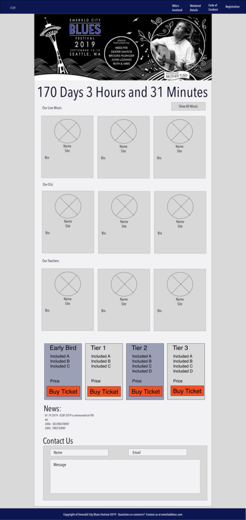
UX Researcher

Emerald City Blues Festival

The Goal: To plan and organize a website for the social dance scene.

The Problem:
Emerald City Blues Festival needs a website to provide information for the community.

The Solution:
A user based structure that provides the most relevant information.

About
Emerald City Blues Festival – User interviews, building navigation, creating style guide and visual design.

Overview
Emerald City Blues Festival had previously been shared with the public solely on Facebook, and there was a need to create a website. I interviewed users of social dancing websites, researched what other events have done, and iterated the nav based on top reasons for users to go to our site, and top things the business want to communicate.

Role
UX designer

Tools
Trello, Sketch, paper and pen, InVision

Results
Hundreds of people came to celebrate Blues with ECBF, and the event felt like an event during the heyday of Blues in Seattle! 

The Process:

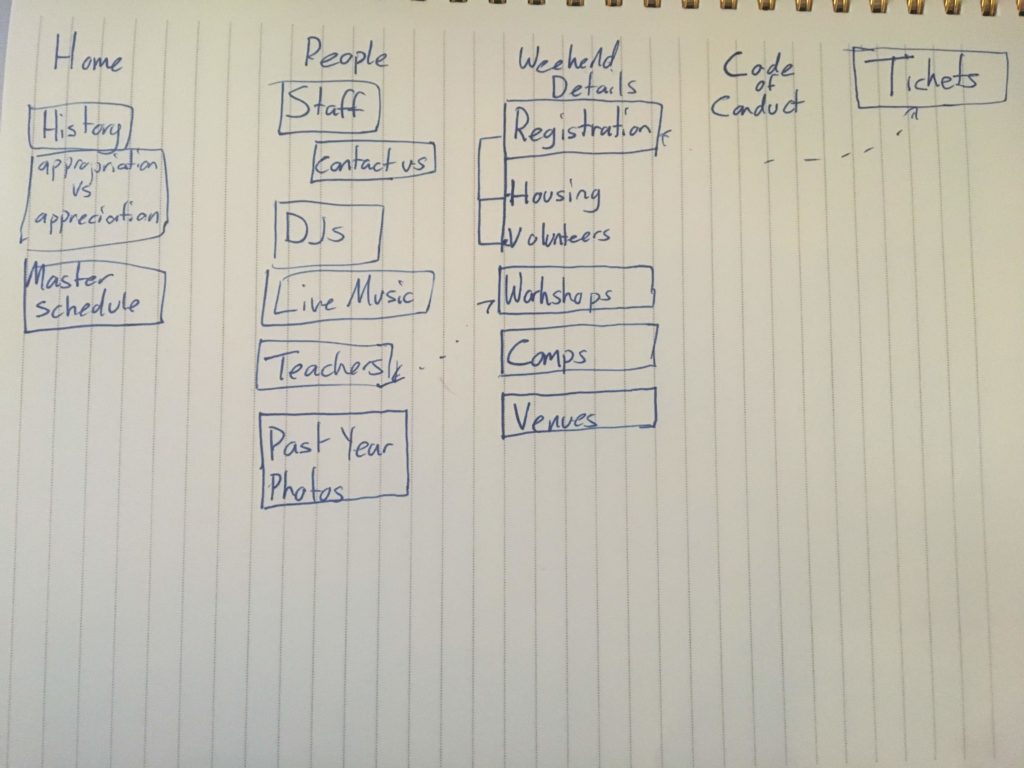
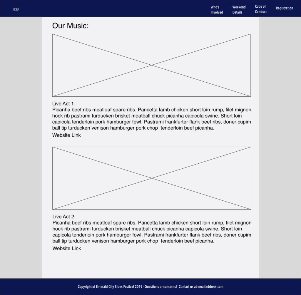
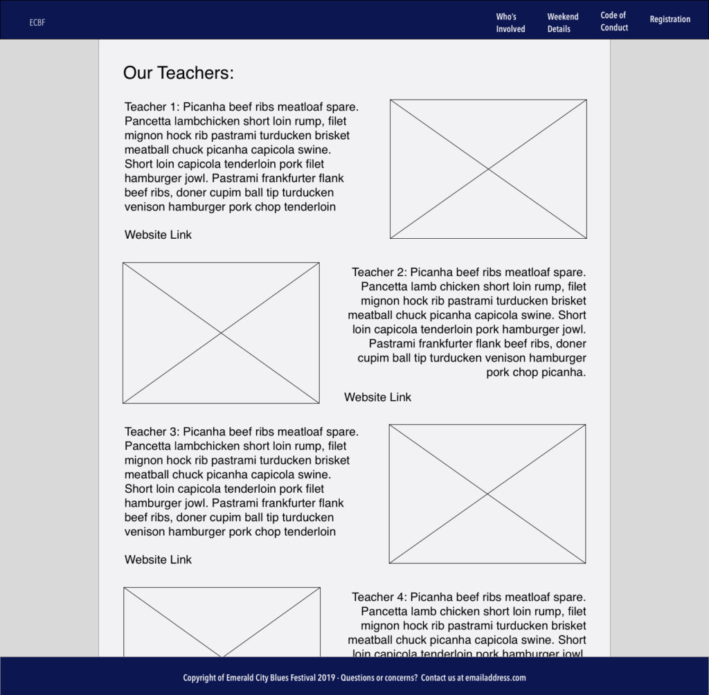
I began with a list of elements that would need to be on the website such as a staff page, information about classes, who’s teaching, etc, and a vague idea on how they should be laid out. With this type of event, many users utilize Facebook as a primary tool to gather information, and it was my mission to find out why.

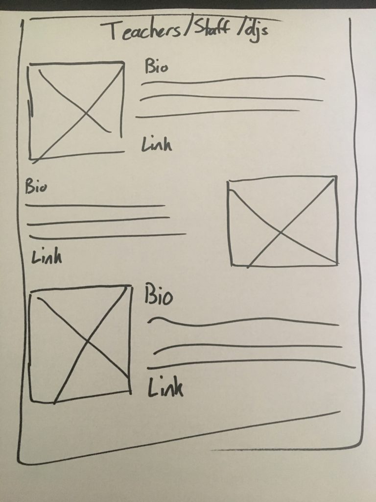
I interviewed five different dancers who went to weekend long events both in their home city and places they traveled to. My goal was to find what sorts of information they went to an event’s website for, how often, when in the process, how close to the event, etc. Did users want to read bios of teachers, staff, and DJs? How many people read the code of conduct, and is it important?

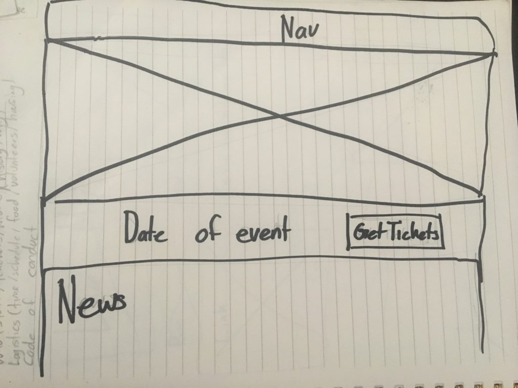
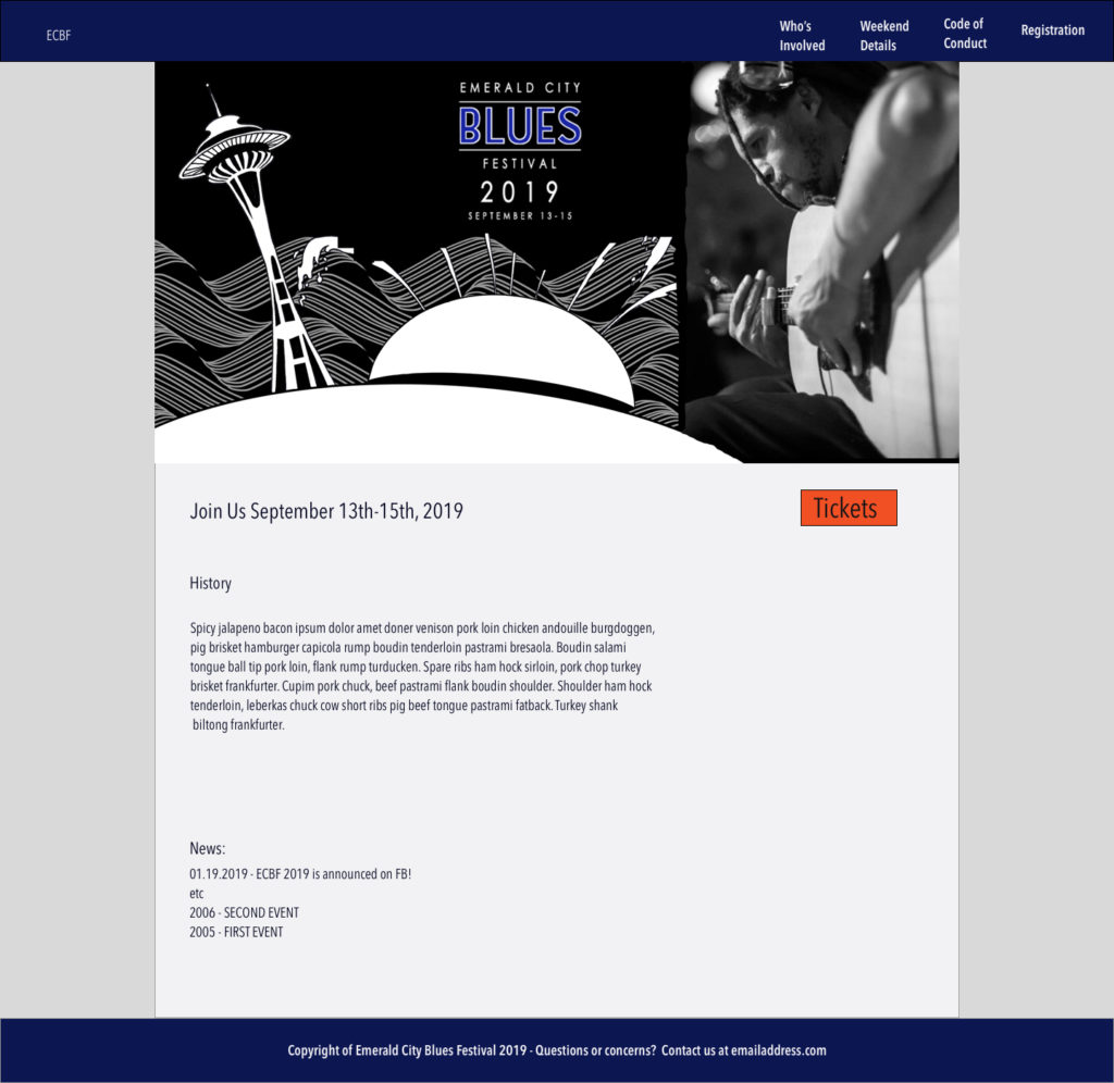
As a whole, our users felt the most important things were the schedule, purchasing a ticket, the code of conduct, and information about registration. All of our users went to the site at least twice, once to buy a ticket, and during the event itself to find the schedule.

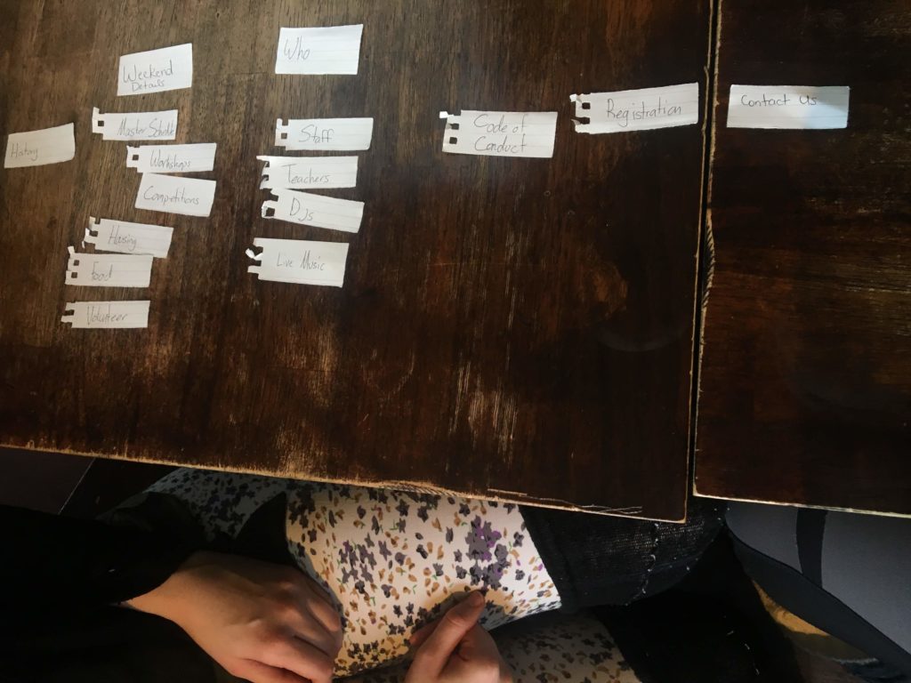
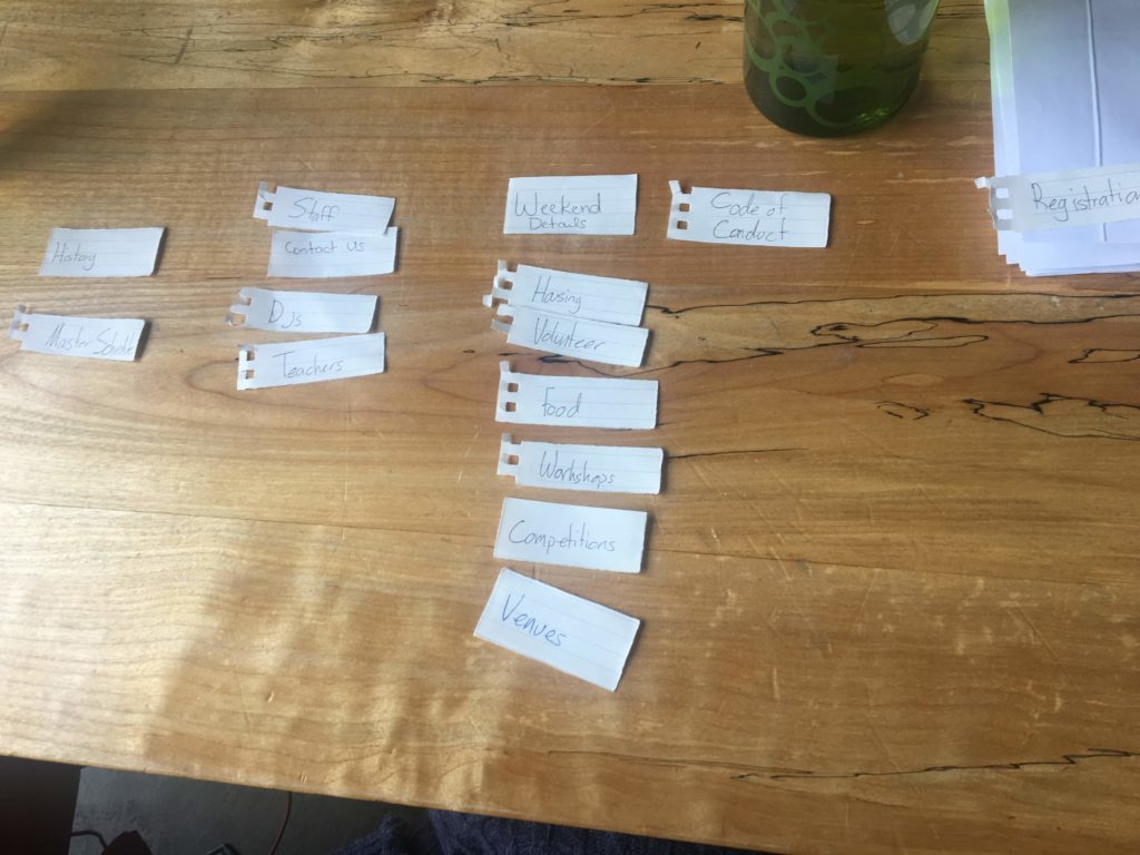
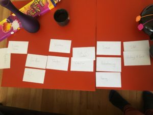
I conducted open card sorts with our users to discover what categories made sense to them, and what had worked in the past.

These conversations brought up common pain points. Different ticket prices are common in these sorts of events, and they’re often released in tiers, with the least expensive tickets first. However, since users want to support the community and these events, users wanted the ability to support the event the best they individually can. Those who are able to pay more wanted to contribute more, and others who do not have the same financial access experienced not being able to attend because the affordable tickets sold out first. We wanted to incorporate transparency with tiered ticket pricing, relying on generosity for higher tickets to sell rather than the fear of missing out of the cheapest prices

Another common complaint was that schedules are often buried somewhere in the depths of the navigation, and it needed to be front and center. Because of this feedback, the schedule will be accessible.

Due to the current social climate in the dance scene, our users agreed that Code of Conduct needed to be highly visible, even if they weren’t intending on reading it. There have been multiple, heated conversations about Code of Conduct, so it’s important for ECBF to show that we are taking it seriously.

To validate these findings, I conducted closed card sorts. Users found the categories to be refreshingly simple, and in line with the “people first” drive of the event.

From here, Michael and I discussed my findings, and I drew out a site map.

With his approval, I started with sketching the individual pages.

We needed a style guide to plug into the site. Recently, there have been events that were ran by people who had questionable morals, and made some people feel unsafe. This event was one of the first blues weekend events in Seattle, and it is an established, trustworthy event. Because of this, I kept the color palate greys and blue, colors that coordinated with the pre-designed logo, and would feel professional.

As our web developer built the site, users expressed a need to change the lay out, so that there was more information on the home screen. I looked at other sites that had some key, similar elements. Competitors were anyone that had a multi-day event with different class tracks, and an array of people listed as contributors in some way. I landed on conveyux.com, a UX design conference that I had attended earlier in the month. The event was hosted by a well known UX Design firm, so it was reasonable to assume their site was well designed and tested.

The next iterations of wireframes for the home page were based on this layout, and this got approval.

I volunteered to resize the staff photos for the site to help with the workload, and for hands on practice. All sorts of photos were provided, and I was able to create a sense of continuity from the subject matter by cropping the images, and working to make everyone’s faces a similar size.

The event was successful at bringing back one of the oldest Blues dancing events in the Seattle area!  The website can be viewed at https://www.emeraldcityblues.com/.

Lonely Produce

Desktop Site

Interaction Designer

LA Fitness

Mobile App

Interaction and Visual Designer
Project Manager

Weird A.i.

Desktop Site

Lead UX Designer